New crown. Same authority.
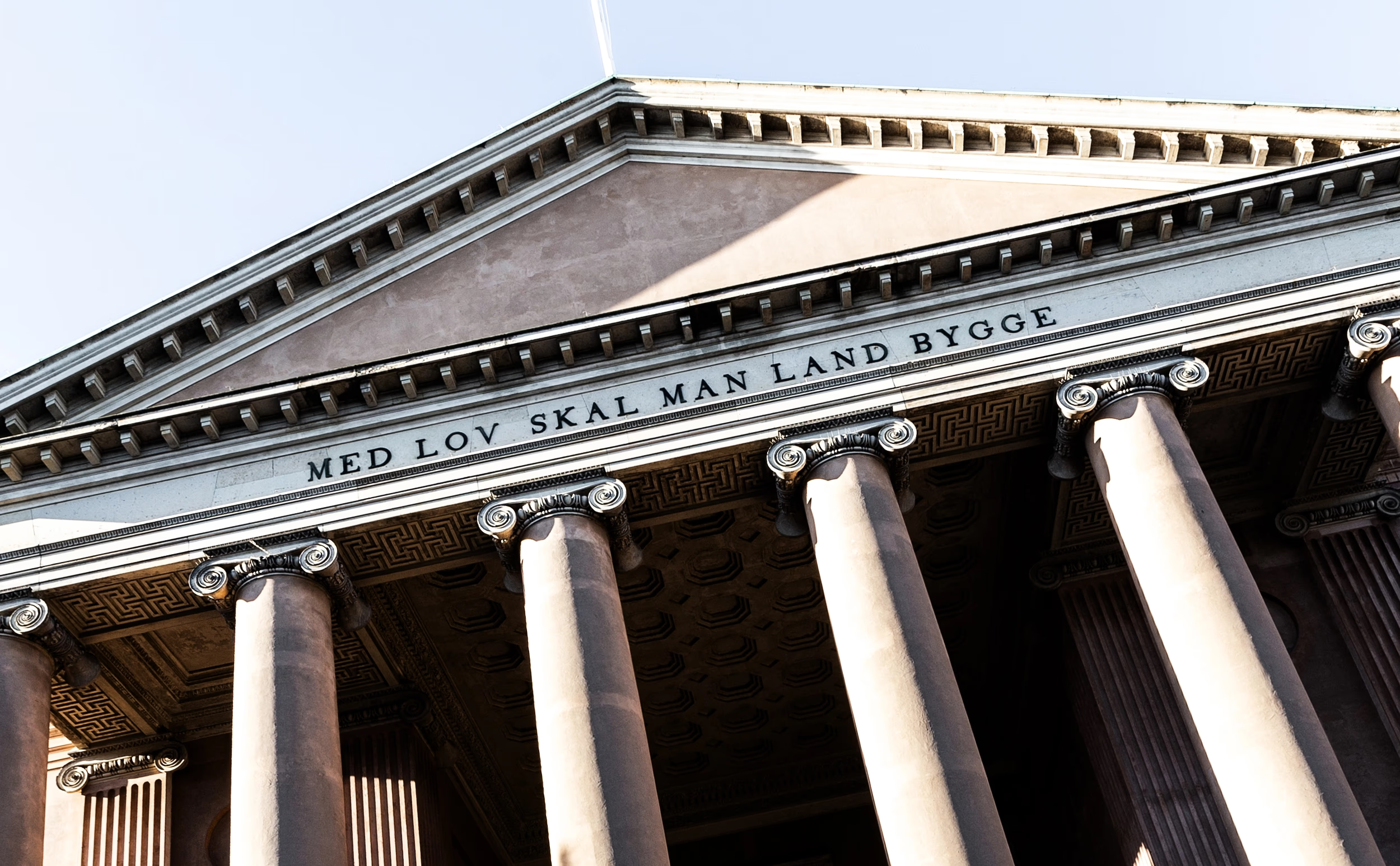

Anklagemyndigheden
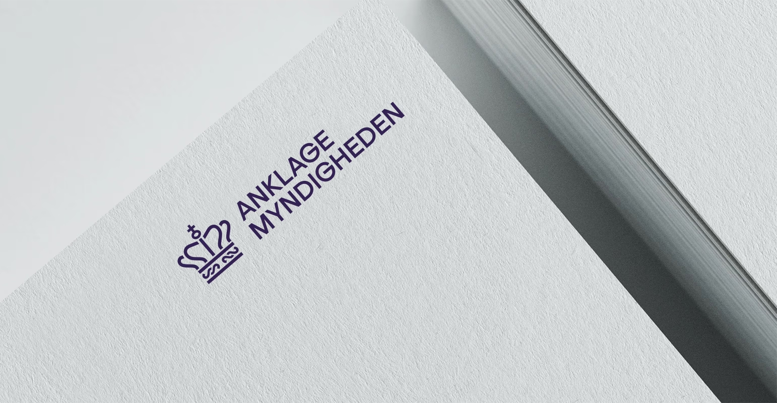
A new crown for an established institution. The Danish Prosecution Service is not a brand that needs to shout. It needs to stand firm.
A new visual identity was created around a redesigned crown, a unified logo system, a new colour palette, typography and a contemporary illustration style.
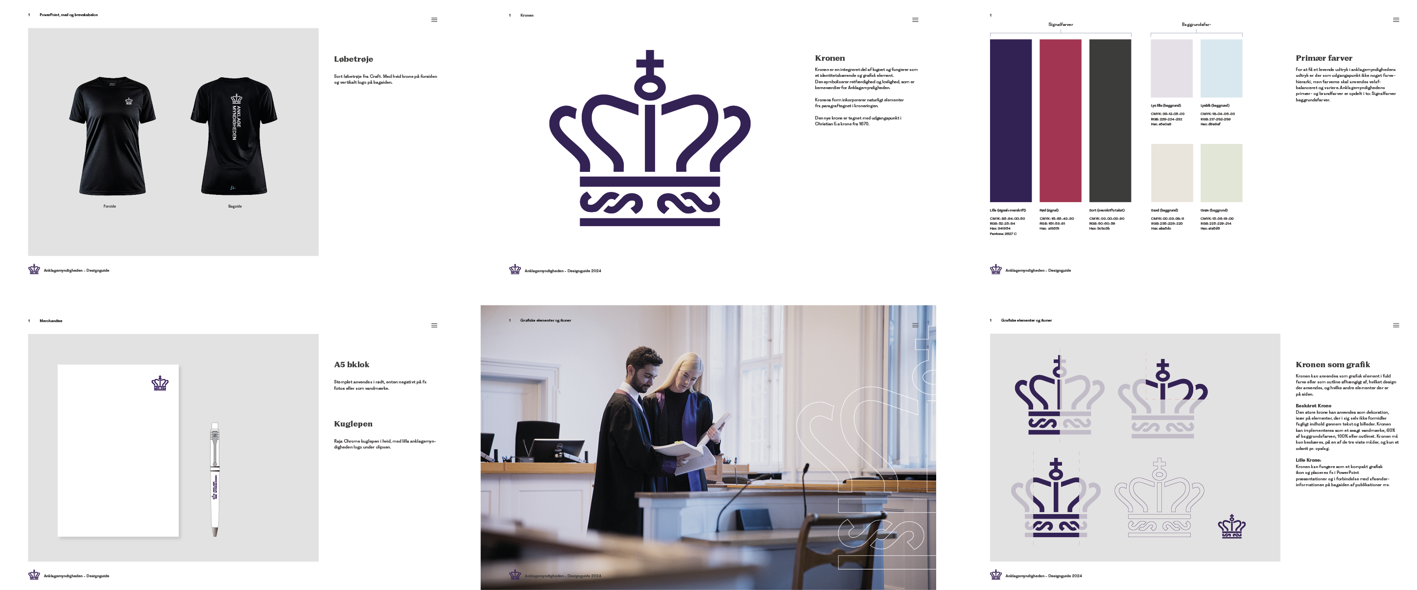
The crown is based on the royal crown of King Christian V but has been redrawn from the ground up. Its distinctive S-shaped details form a subtle section sign – a small detail connecting the institution’s history with its legal role in society.
The result is an identity built on authority, calm and precision. A visual system created for a public institution that needs to communicate clearly – both internally and externally.
The ability to elevate us visually
“It was important for us to find an agency that had both the time for us and the ability to elevate us visually – and we found that in Upland. Janus is calm, sharp and easy to work with. He is good at both listening and challenging us.”
Mogens Agger Tang
Head of Communications
The Danish Prosecution Service


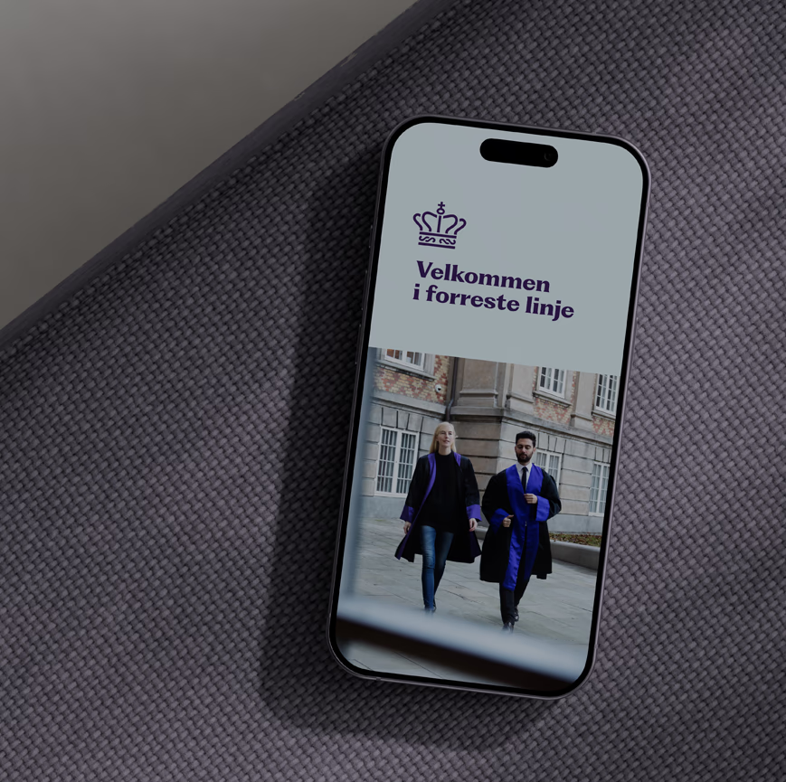


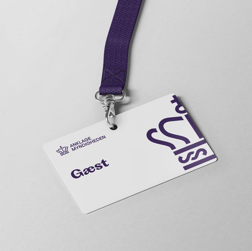
More than a logo. The crown is the central element, but the identity extends far beyond the logo.
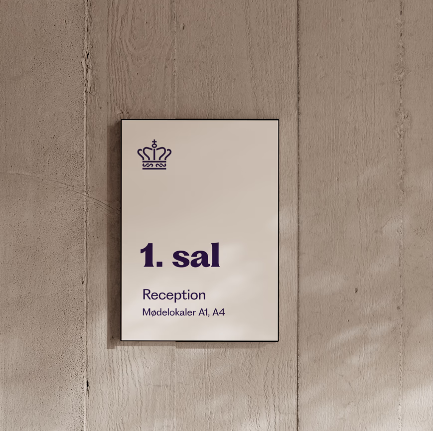
The colour palette is built around a deep, authoritative blue-purple, balanced by white and light grey. Not simply to make an impression, but to work across digital interfaces, print, recruitment materials and signage.
The typography was chosen for clarity and calm. The illustration style gives the identity room to breathe wherever the legal and the human meet – without making the expression feel soft.
The result is a visual design system capable of supporting a large and complex organisation – from the Director of Public Prosecutions and the Regional Public Prosecutors to the National Special Crime Unit – while still appearing as one coherent whole.


Instagram
LinkedIn
Facebook
Upland Studio ApS
hello@uplandstudio.dk
+45 22 11 28 59